First design of my Yum Yums label
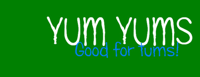
This was my initial design for my Yum Yums food product. Before making the decision to change my brand label I asked a group of 5 mothers while standing outside a local Tesco Extra store which label they felt was more effective (the dark green background label on the left or the light green label below) 5 out of 5 mothers chose the label below. Because they felt that if they had seen the product with the darker background because of the blue font on the label not being so clear they wouldn't stop to look twice, whereas the product label below was more eye catching.
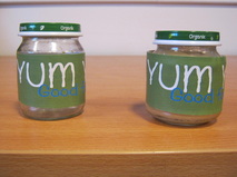
First label design on food jars
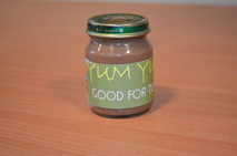
Final product label design
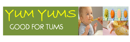
This is an image of my new Yum Yums label, as you can see I have added 3 small sized images along with a different coloured font for the text (Yum Yums) and have placed it ontop of a light green background, making it easier for mothers to see the brand name, enbaling them to easily identify the product in supermarkets.
